The Brief
Brand
Linjer — a fine jewelry brand known for clean, elevated design. Existing design system uses Avenir as the primary sans-serif. Tone is quiet luxury, not loud sale.
Campaign
15% Off All Jewelry for Mother's Day. No coupon needed, ends Sunday. The discount is the message — the creative job is to make it feel like a gift, not a promotion.
Constraints
1080×1920 story format. Three visually distinct ads — not the same template with swapped images. Use influencer and product imagery from the brand's existing website and social.
Creative Direction
Avenir for sans-serif. Creative liberty on everything else. Each ad should have a different concept — not just a different photo. Three different emotional angles on the same sale.
3 Creative Directions
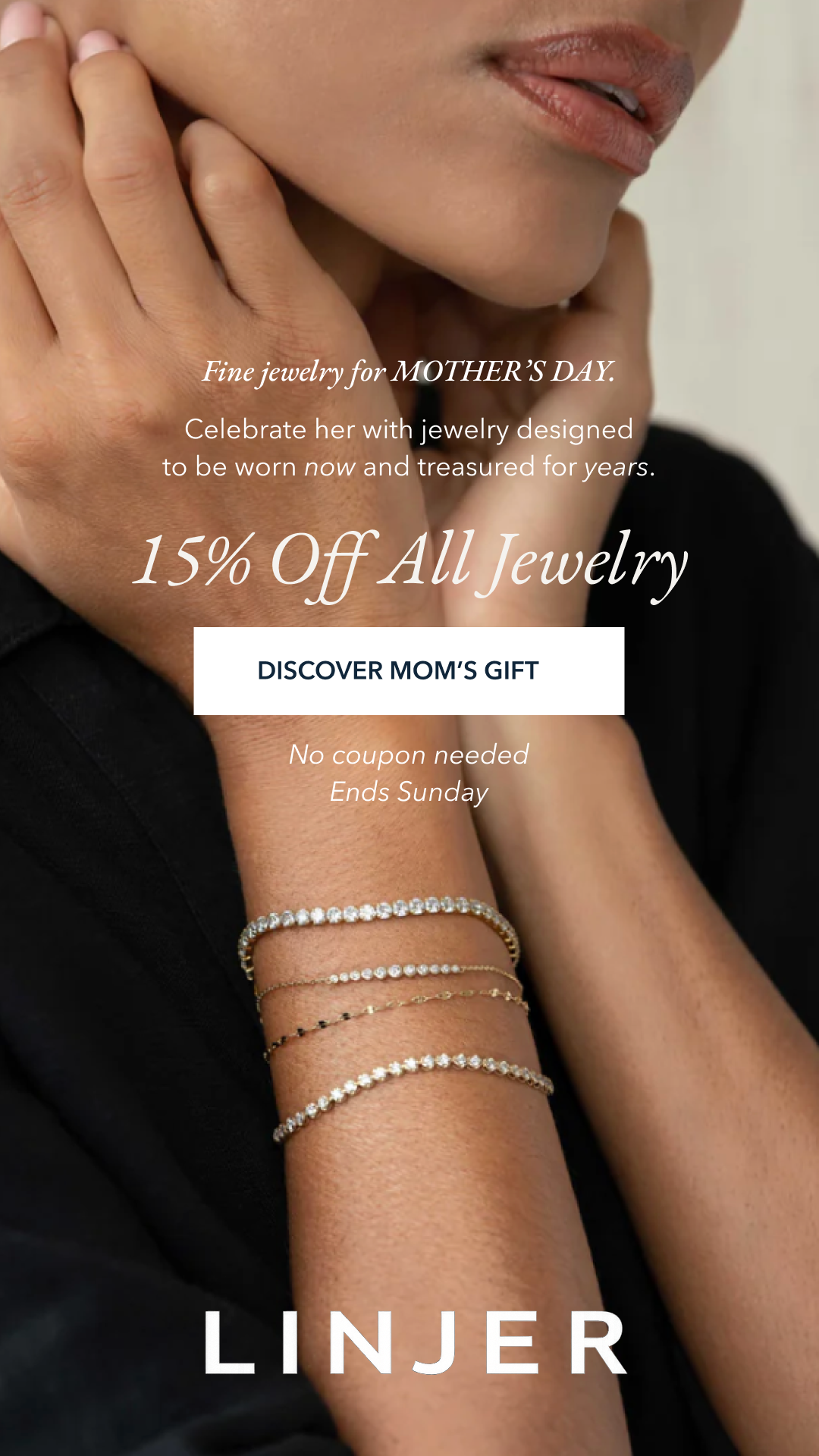
Ad A · Editorial
Influencer model wearing jewelry. Full-bleed photo. Text overlay at center. The luxury editorial pull — sells the feeling of wearing fine jewelry.
Full-bleed photo
Script + serif type
White on dark
Minimal layout
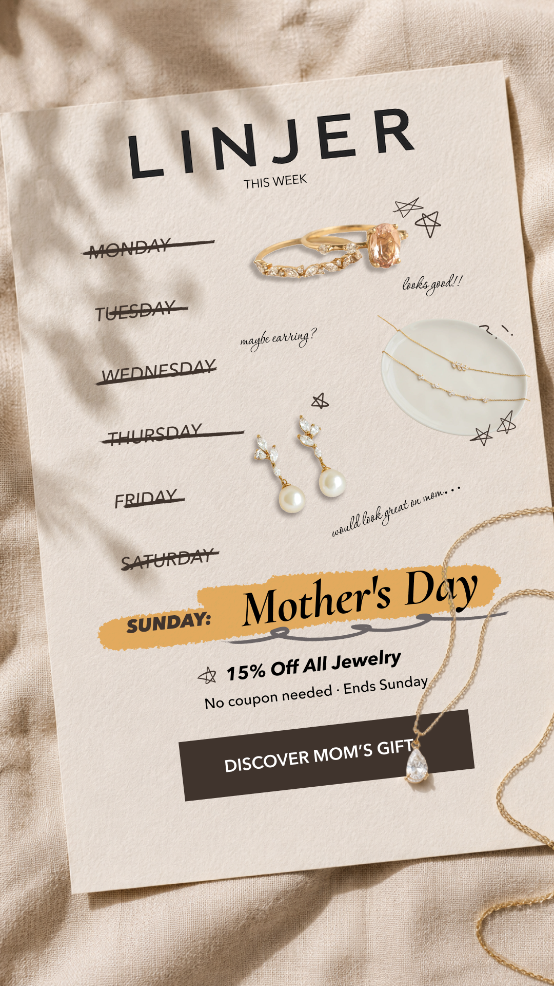
Ad B · Playful Countdown
A week-view "this week" calendar with days crossed off — Mother's Day lands on Sunday. Product cutouts float alongside handwritten annotations. Earthy, tactile, human.
Paper texture bg
Calendar format
Product cutouts
Handwritten notes
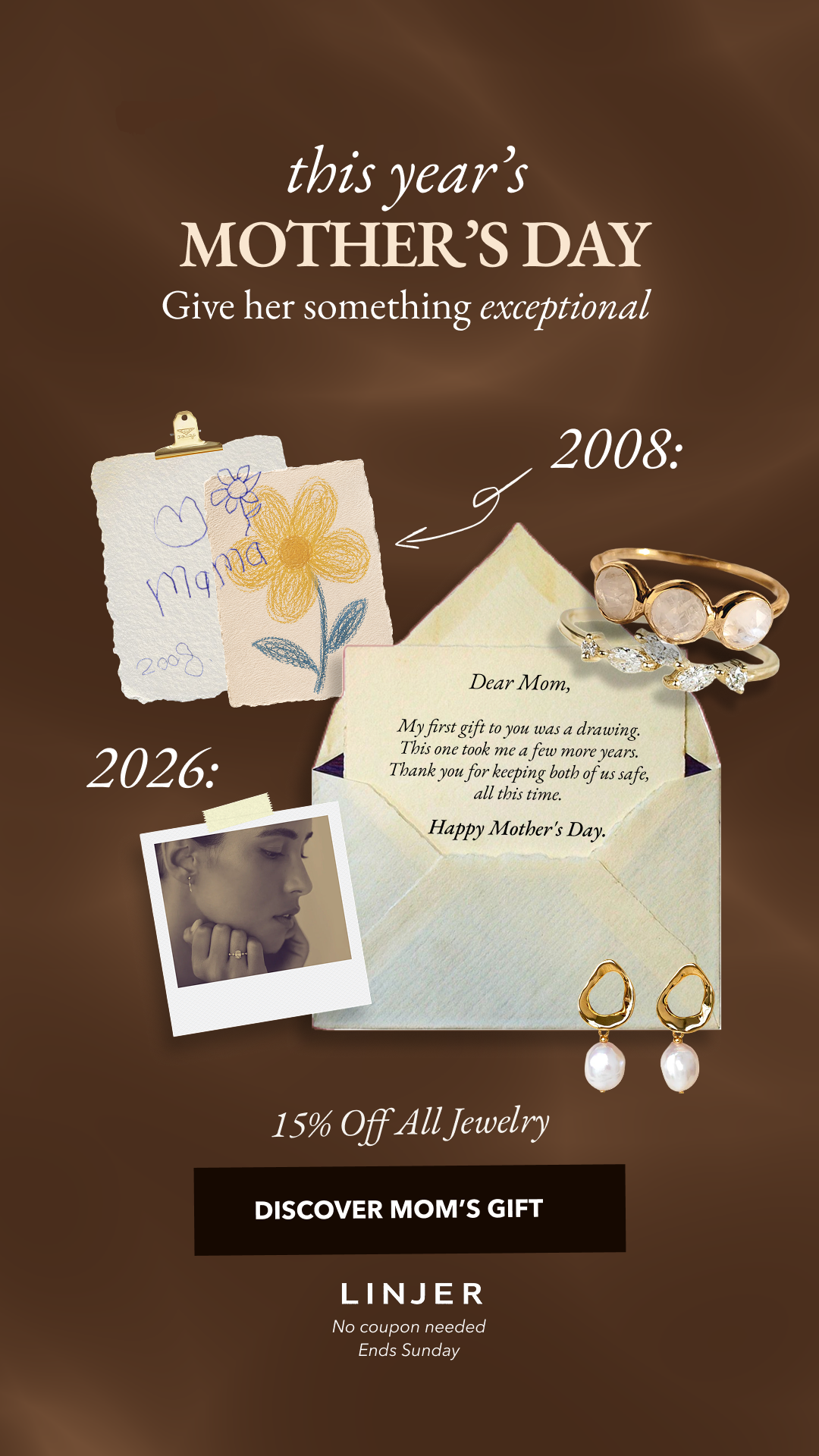
Ad C · Nostalgic Narrative
A warm brown collage: a child's drawing from 2008, a handwritten letter "Dear Mom," and a polaroid of an influencer wearing jewelry in 2026. Storytelling over selling.
Warm brown palette
Collage / scrapbook
Emotional copy
Then vs. now arc
Design Decisions
Three concepts, not three templates
The brief asked for each ad to "be a bit different" — not just trade out an image. Each has a distinct visual format: editorial full-bleed, playful scrapbook countdown, and nostalgic collage narrative. A viewer swiping their feed would experience three different moods, not three sizes of the same poster.
Avenir + serif pairing
Avenir is the brand's primary sans (used heavily in existing emails). Paired with a script/italic serif for the sale callouts and emotional moments — this keeps the brand voice intact while adding warmth that's appropriate for Mother's Day. Pure Avenir would feel too corporate for the occasion.
Ad B's calendar mechanic
The crossed-out weekdays make the countdown visceral without stating it — you feel Sunday approaching. It also gives the ad a format reason to exist as a story: the format matches the medium. Product cutouts float as "wishlist" items you've been adding all week.
Ad C's 2008 / 2026 arc
The letter reads: "My first gift to you was a drawing. This one took a few more years." It repositions the jewelry not as a purchase, but as the grown-up version of something you've always wanted to give. Emotional truth first — the discount is mentioned last, almost as a footnote.
Influencer imagery, not product-only
The brief explicitly allowed pulling influencer assets from product pages. All three ads use lifestyle imagery — jewelry worn, not laid flat. Fine jewelry lives on skin; the ads should reflect that.