Overview
Freelance visual designer for Joydotz, a hydrocolloid spot-patch brand, through Swedish Falls LLC. The brand was repositioning for the US market with a Gen Z audience in mind, and the existing site still read as a generic acne-treatment product. I rebuilt the color system, the product and site visuals, and the site's interaction design around a softer, more collectible identity that fit how that audience actually shops.
US Rebrand+Gen Z
Visit joydotz.us ↗Color System
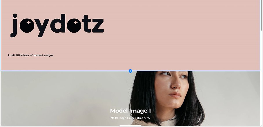
Homepage
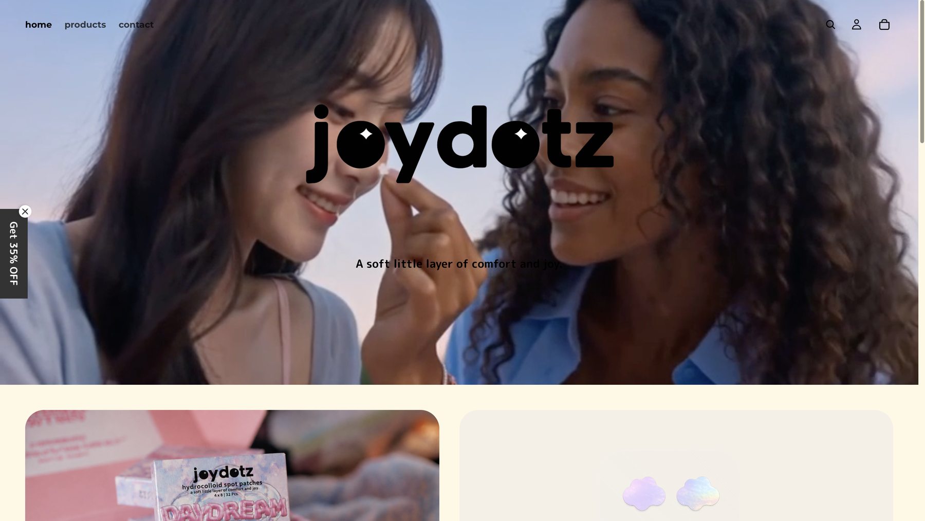
 After
Before
Hover for before
After
Before
Hover for before
Video hero, gradient nav, and sparkle eyes set into the logo.
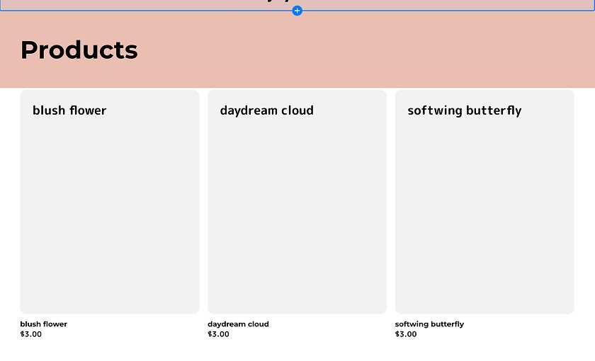
Product Listing
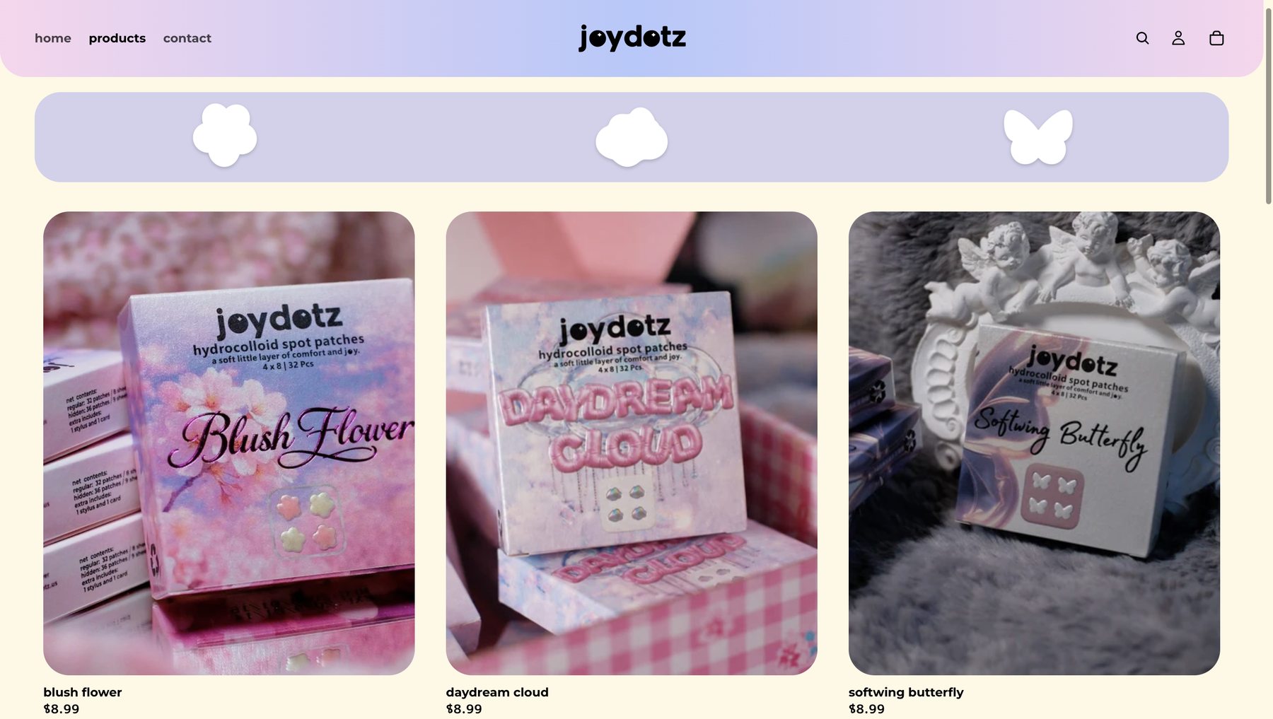
 After
Before
Hover for before
After
Before
Hover for before
Shape filter (flower / cloud / butterfly) mirrors the three patch collections, glows on hover.
Product Page
 After
Before
Hover for before
After
Before
Hover for before
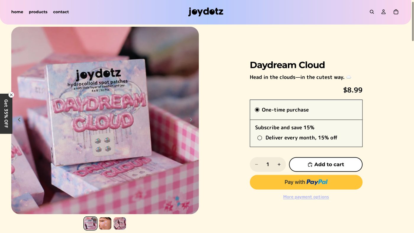
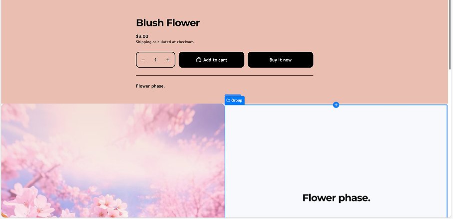
Real packaging photography, subscribe-and-save, checkout buttons matched to the palette.
Cross-Sell
 After
Before
Hover for before
After
Before
Hover for before
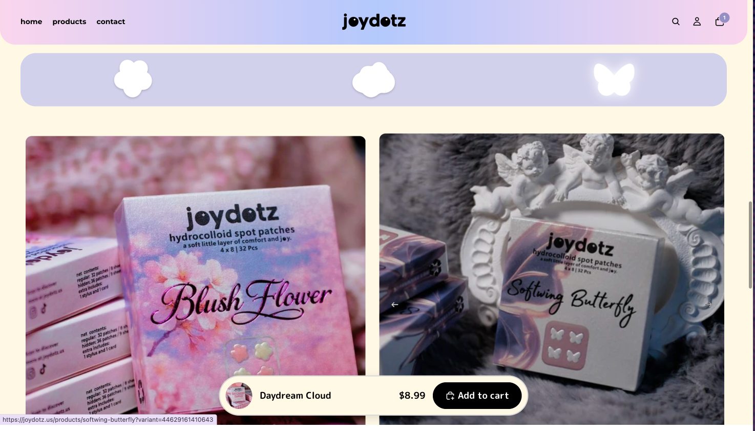
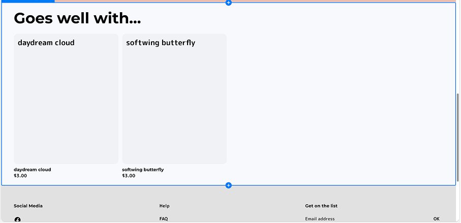
Sticky add-to-cart bar, "goes well with" cards pick up the shape icons and glow.
Footer
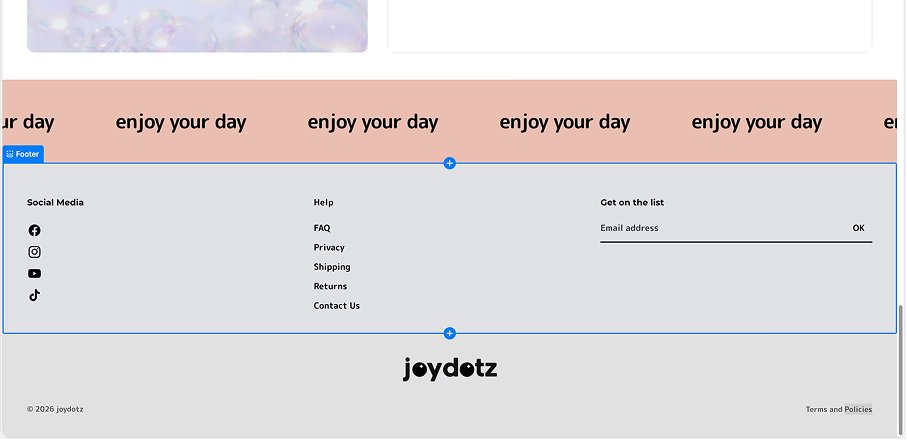 After
Before
Hover for before
After
Before
Hover for before
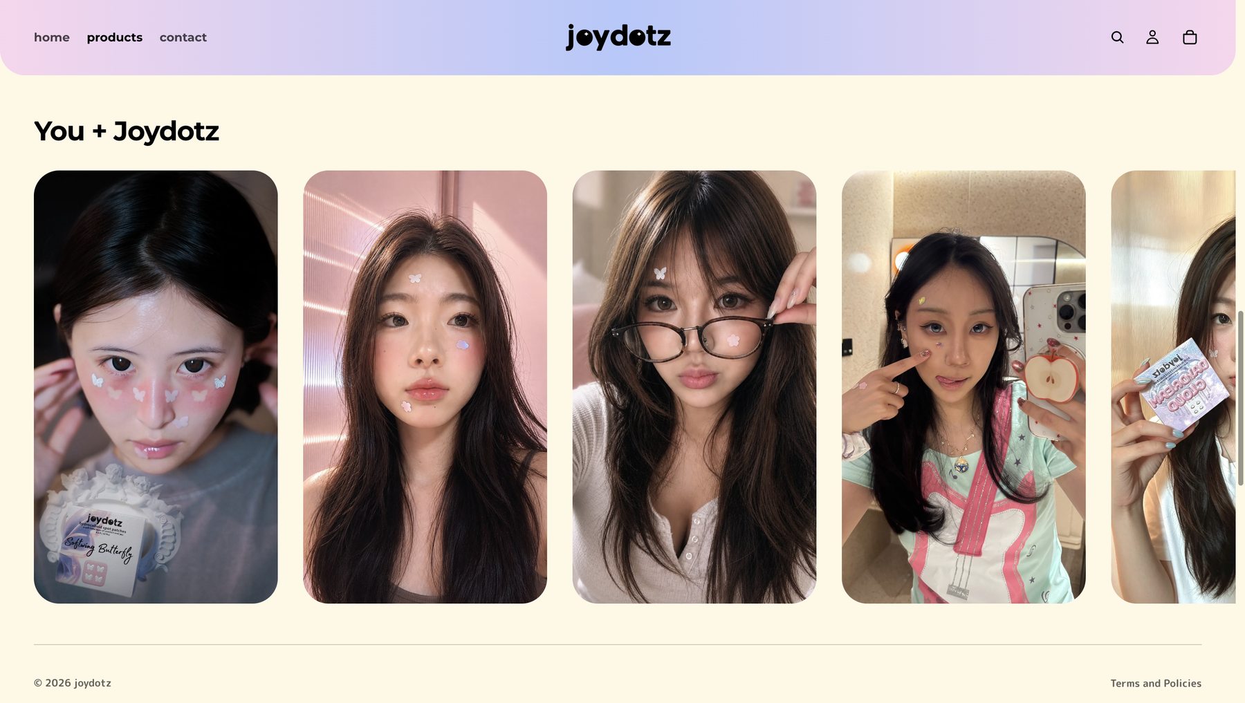
Reflection
Took Joydotz from a default Shopify skin into a cohesive, interactive brand system built for its US Gen Z audience: a packaging-derived color palette, a shape-based product language, and a mascot moment that carries the identity to the footer.
Working from an established brand rather than a blank page meant finding the fresh angle already hiding in the packaging, the color gradient, the shape language, instead of inventing one from scratch, then carrying it consistently across every touchpoint.