The Brief
Brand Moment
Joydotz needs website visuals that feel soft, cute, clean, and trustworthy. The popup should match the product world rather than feel like a generic discount interruption.
Conversion Goal
35% off is the main hook, but the visual has to make the offer feel like a reward. The layout should make signing up feel immediate without looking aggressive.
Visual System
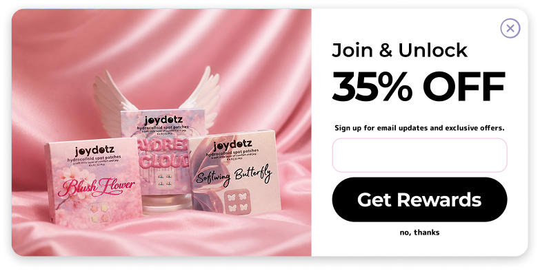
The design uses a product still-life on the left and a clear signup action on the right, keeping product recognition and functional conversion equally visible.
AI Workflow
AI helped shape the campaign direction and presentation logic, while the final design decisions focused on hierarchy, brand consistency, and ecommerce usability.
Final Popup
Left Panel
Product packaging sits on pink satin to build a beauty-brand mood before the user reads the offer.
Right Panel
Large numeric typography makes the discount instantly scannable, while the empty field and black CTA create a clear action path.
Tone
The layout keeps Joydotz playful without becoming messy: soft image, sharp type, rounded input, and one high-contrast button.
Design Decisions
Split image and action
The popup separates desire from action. The left side creates product trust and softness; the right side handles the conversion task. This keeps the UI calm even though the offer is bold.
Oversized discount type
The 35% off message is intentionally the largest element. Users often decide whether to close a popup in under a second, so the value proposition has to be understood before the rest of the copy.
Beauty texture, not stock texture
Pink satin gives the product a soft cosmetic atmosphere and echoes the packaging palette. It feels more brand-specific than a plain ecommerce background.
Black CTA for clarity
The brand can be cute, but the conversion button should not disappear into the pink. The black pill button creates a strong anchor and makes the next step obvious.
Low-friction exit
The small "no, thanks" line keeps the popup from feeling trapped. A softer brand needs a softer refusal path too.