Overview
One letter J, tiled until the gaps between letters draw a second shape of their own.
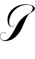
The brief: use a single glyph to build a pattern where positive and negative space read equally well, then make two images that are exact opposites of each other. I tested a script J from Deseo Medium against a blackletter J from Ziyoudian, a Chinese typeface, then mirrored and rotated the Deseo curve until the pattern locked.
Exploration
Two typefaces, one winner.
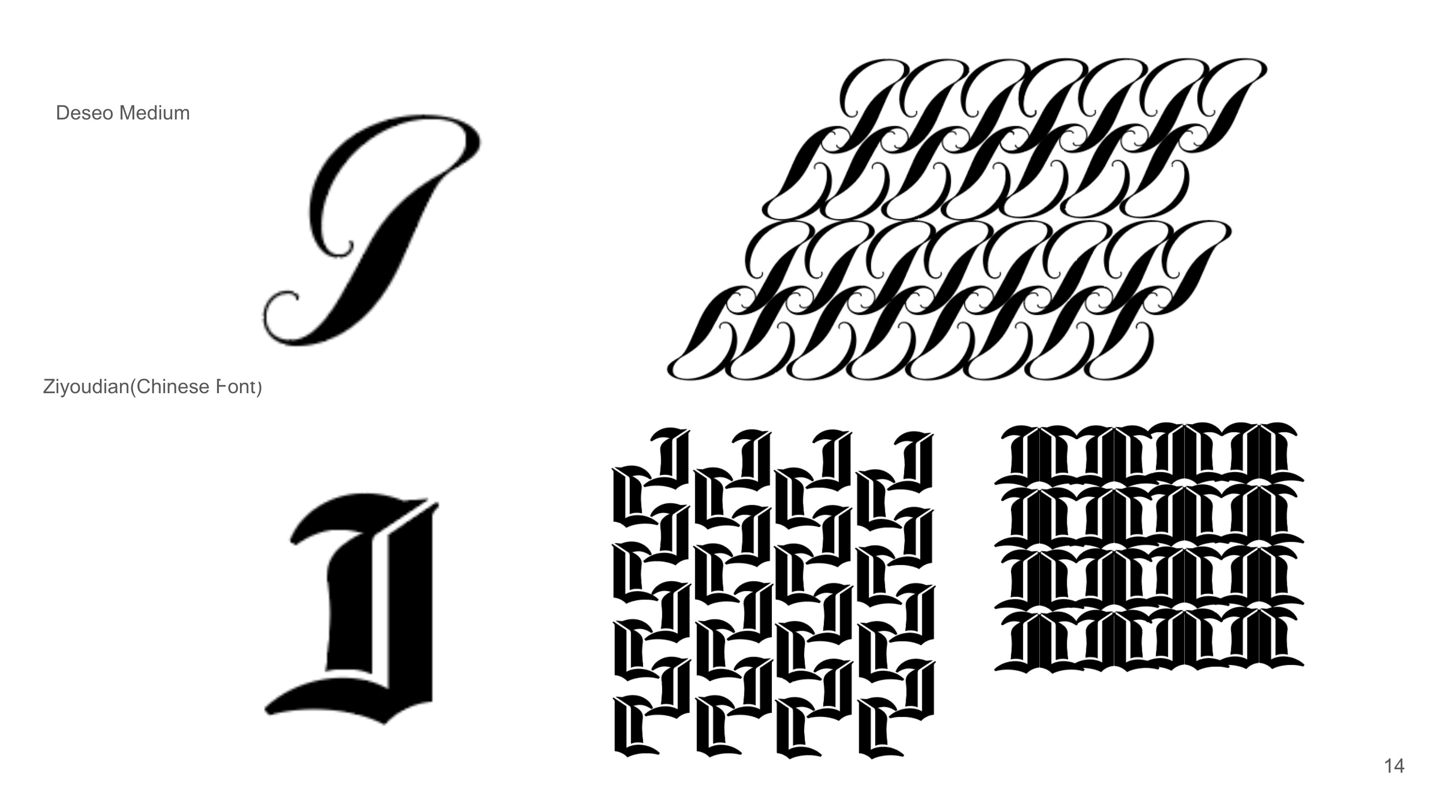
Deseo Medium vs. Ziyoudian
Visual Guide
Color, type and how the pattern behaves.
01Color Palette
#5FB8C9Primary ground and pattern bands#275DA7Glyph figure and wordmark shadow#CC792EAccent diamonds and wordmark#000000Glyph outlines and detail#FFFFFFNegative space and packaging base02Colorways
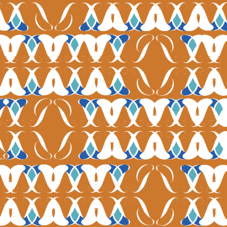
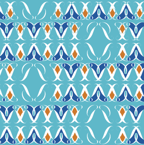
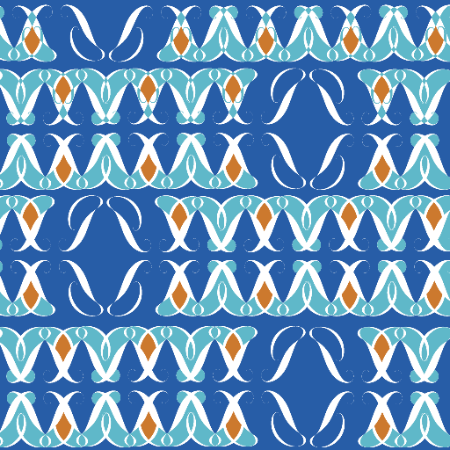
Same tile, three grounds: orange, aqua, cobalt
03Typography
AM Assab
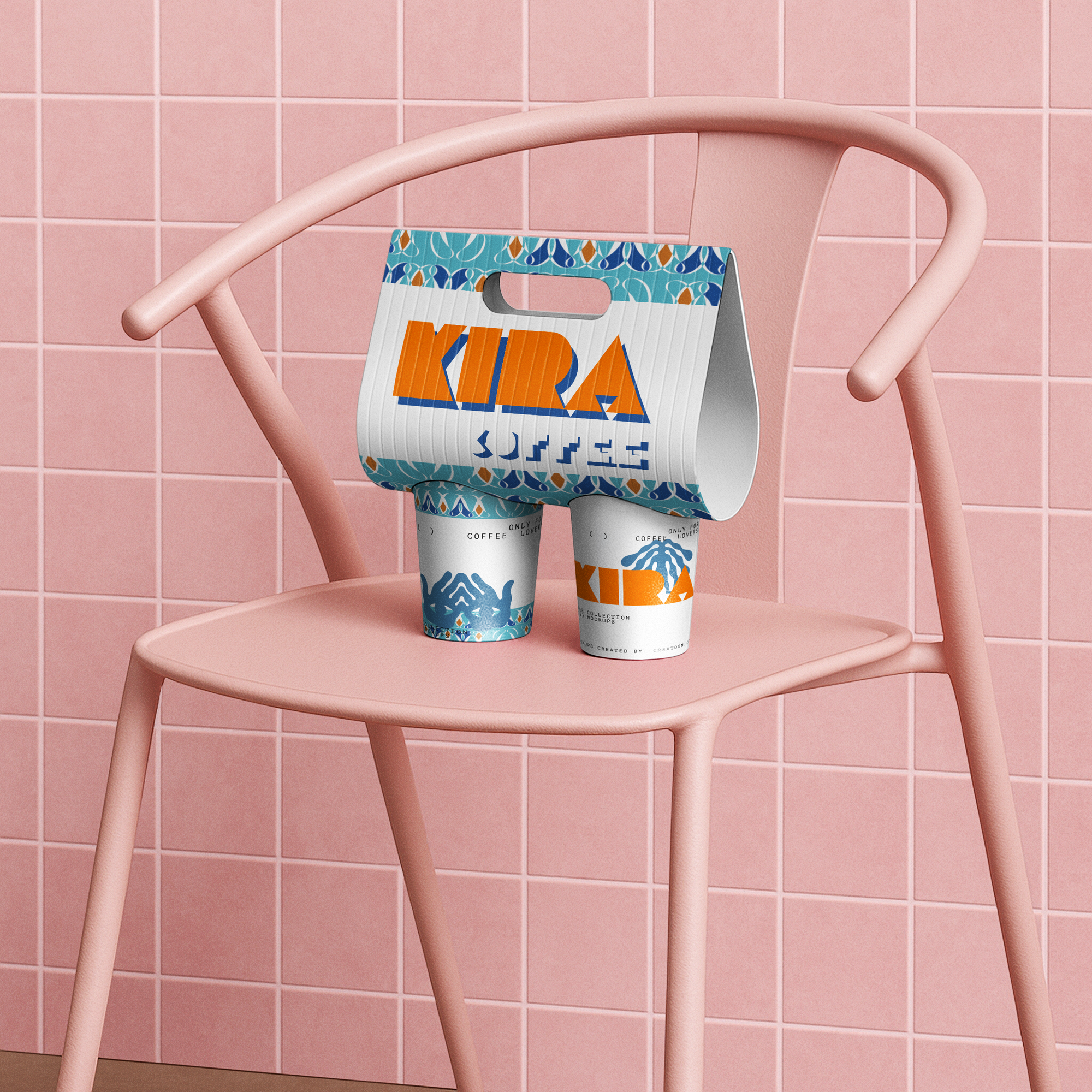
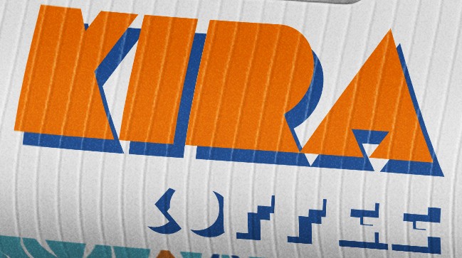
Used for the KIRA COFFEE wordmark. Orange letterforms with an offset cobalt shadow, set on a white field so the logo reads clearly against the busy pattern.
Deseo Medium
The script J that builds every tile. Mirrored and rotated so the curves interlock and the gaps between letters form a second shape.
04Pattern Rules
Build
- One glyph only. Every shape comes from the Deseo J, mirrored and rotated.
- Figure equals ground. Positive and negative space should both read as shapes.
- Swap, don't add. New colorways come from swapping the five palette colors, not adding new ones.
Apply
- Pattern as border. On packaging, the pattern runs as bands at the top and bottom edges.
- Logo on white. The wordmark always sits on a clean white field, never directly on the pattern.
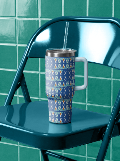
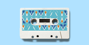
- Wrap the form. On cups, tumblers and cassettes, the tile wraps the whole surface or label.
Applications
Coffee carrier, tumbler, cassette.