Overview
A personal identity system built around contrast: editorial precision meets energetic transformation.
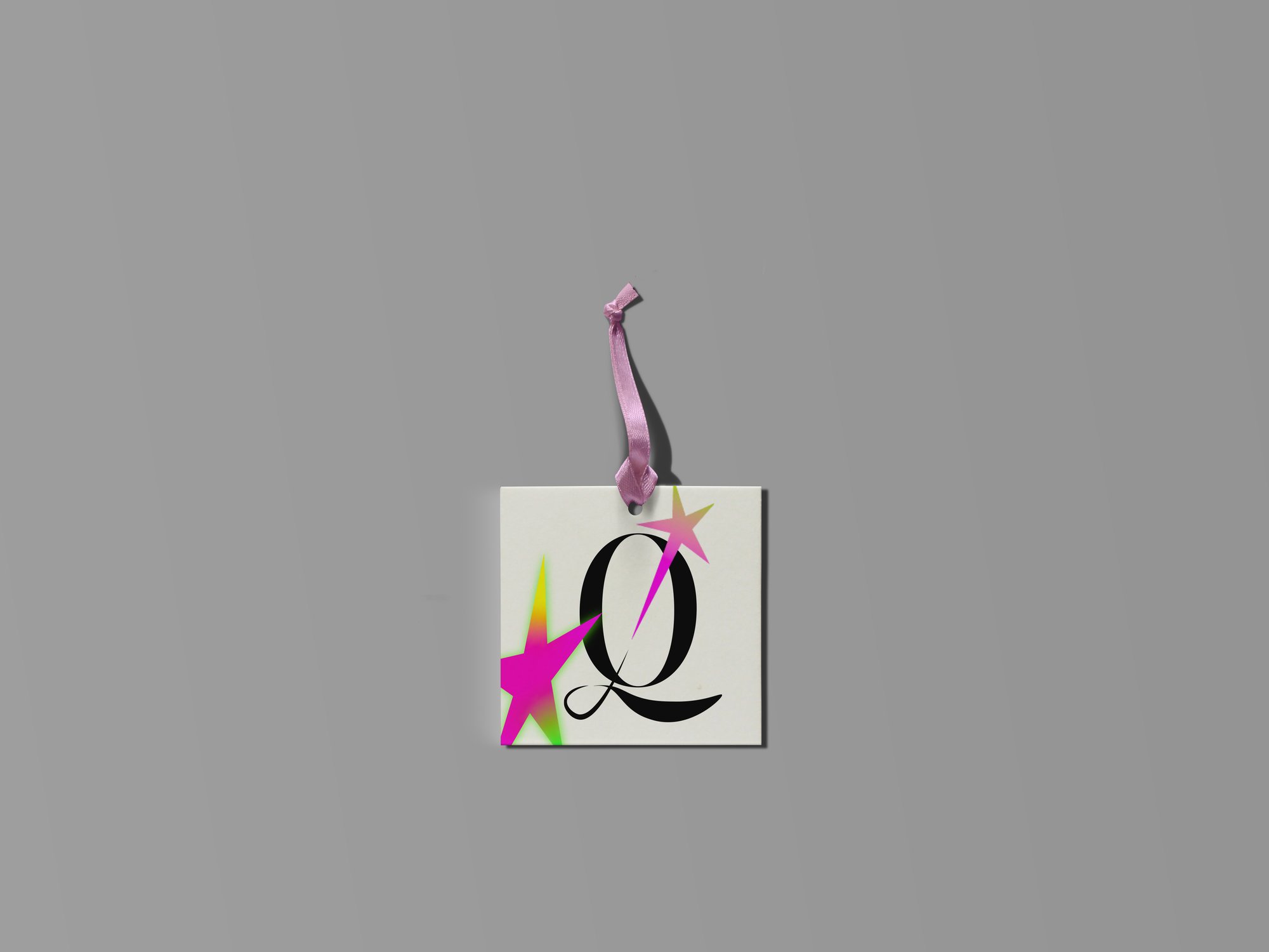
I designed my own identity to carry a multidisciplinary practice across cultural programming, digital design and community-facing work. The serif structure communicates craft and authorship, and the star brings curiosity, momentum and a disruptive spark.
Brand Intent
Create a personal identity that is distinctive without being tied to one medium, and recognizable across print, environmental and digital applications.
Editorial precision meets energetic transformation. The serif structure communicates craft and authorship; the star introduces curiosity, momentum and a disruptive spark.
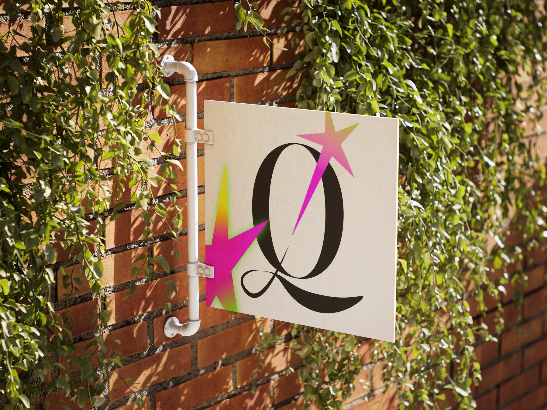
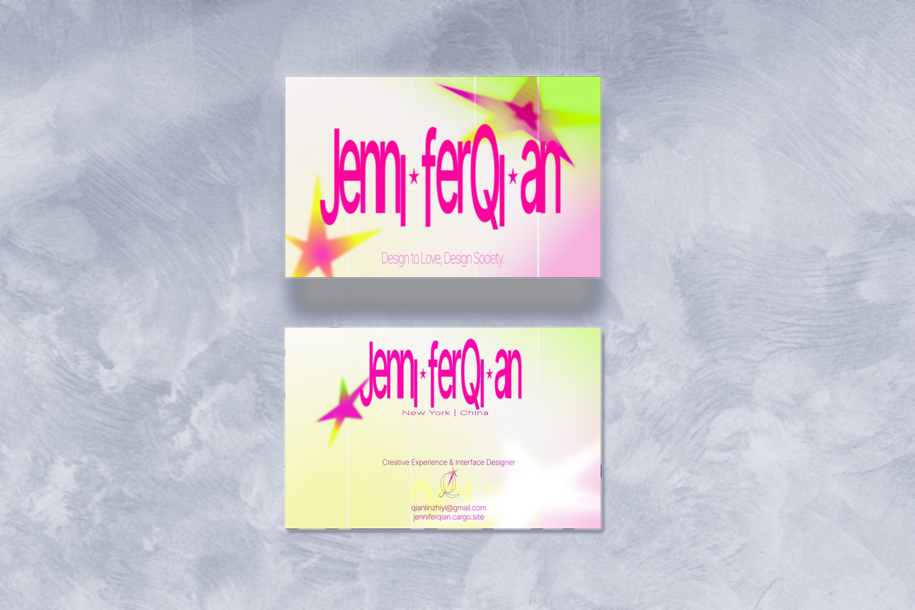
A scalable family of marks: a Q-and-star monogram, a full Jennifer Qian wordmark and a compact JQ lockup, supported by a controlled high-energy palette.
Editorial precision
meets energetic
transformation.
Applications
Process
01Letterform Exploration
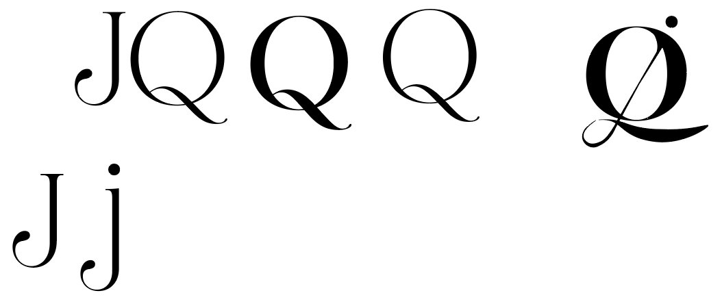
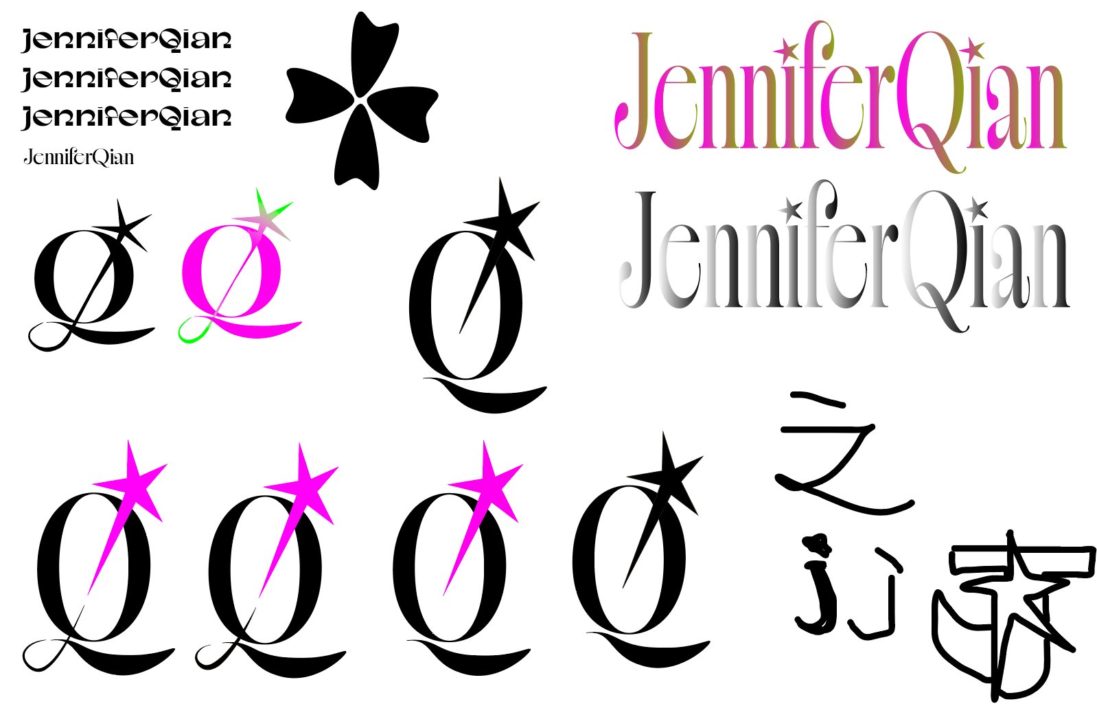
Early studies tested the initials J and Q through overlap, shared strokes, extended tails and full-name wordmarks. The circular body and expressive tail made the Q the most distinctive foundation for the system.
02Symbol Development
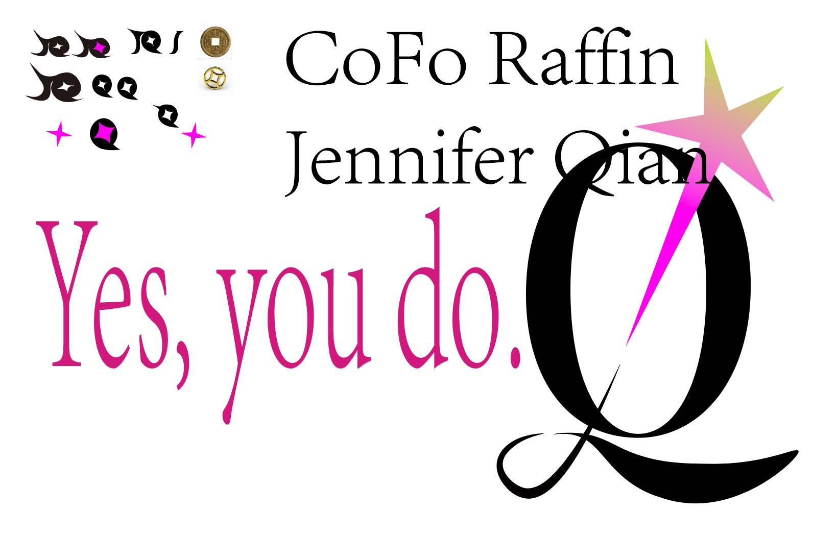
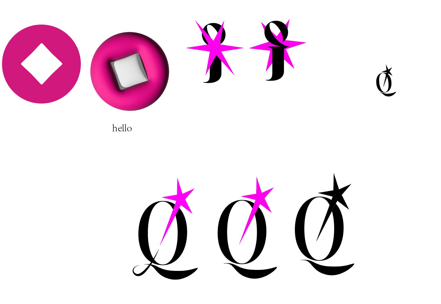
Coin-like emblems, diamonds, petals and starbursts were explored as secondary forms. The star proved most effective because it could act as a spark, a marker and a graphic interruption within the Q.
03Refinement
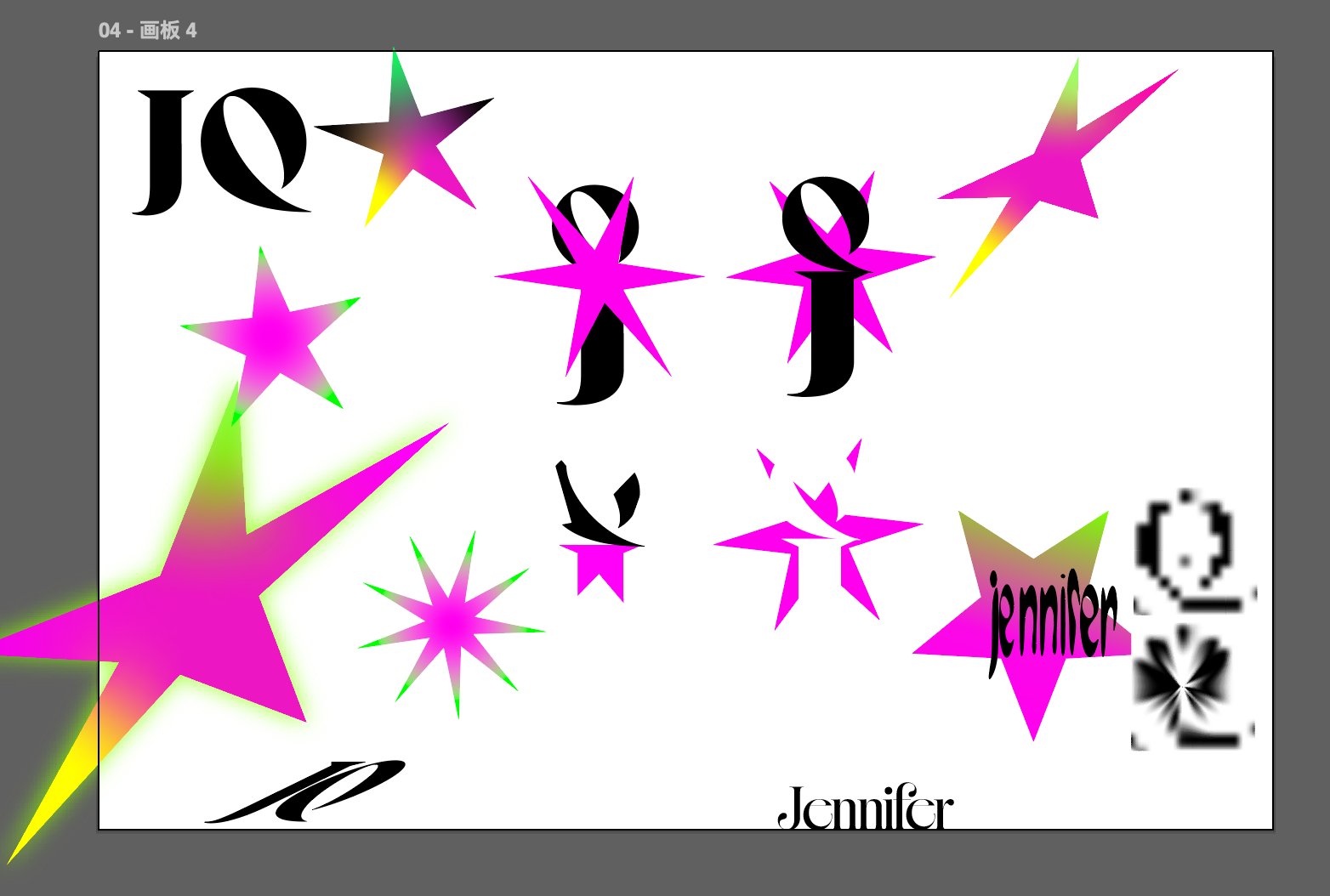
The final direction stabilizes the black serif monogram and uses electric magenta as the signature accent. Larger applications can introduce acid gradients and expanded star forms; small applications return to a simple solid mark.
Visual Guide
One mark, clear rules: the Q-and-star stays fixed while color and scale flex.
#0A0613#FF1AA8#D7FF45#F7F1EA#8CC8FFInk + Ivory base · Pink signature · Green and Blue sparingly