Overview
Headspace is a meditation app people open when they are stressed. Its onboarding makes them sit through ads first.
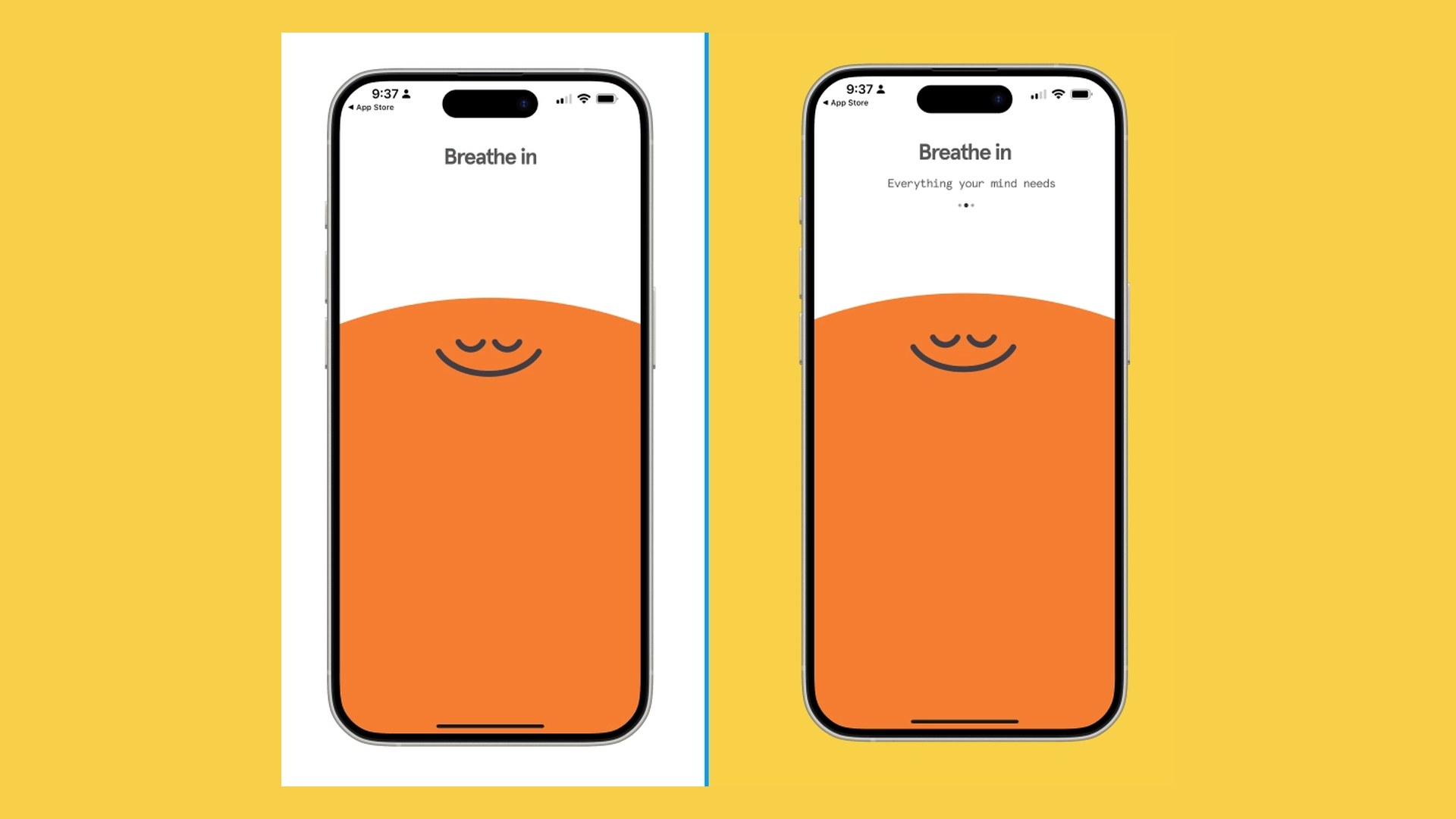
A guided meditation and sleep app with a calm, cartoon-led brand and a signature "breathe in, breathe out" opening.
Onboarding runs about 6 minutes and 17 screens: three App Store style promo pages, a sign-up wall, a goal picker that changes nothing, then a long breathing exercise.
The people opening the app are anxious or in a hurry. Ads in the first seconds read as "we want your money, not your calm," and the drop-off happens before the first real session.
Group work with Haley and Jindi on research and discussion. I owned the breathing-animation copy and the microcopy pass. Earlier onboarding screens via App Fuel.
Who it's for
Three people, one shared mood: not patient.
Research
We walked the flow as each of these people, stage by stage.
5E journey map · how the mood moves through onboarding
Promises calm. Fine.
Breathe-in, then three promo pages and a sign-up wall.
Goal picks change nothing; 1.5 to 5 min of breathing before any content.
Lands on home with a 30% off pop-up stacked on top.
Trial and reminder prompts are the reason to return, not a session.
Mood curve is our read from walking the flow as each persona, not measured data.
Walkthrough audit
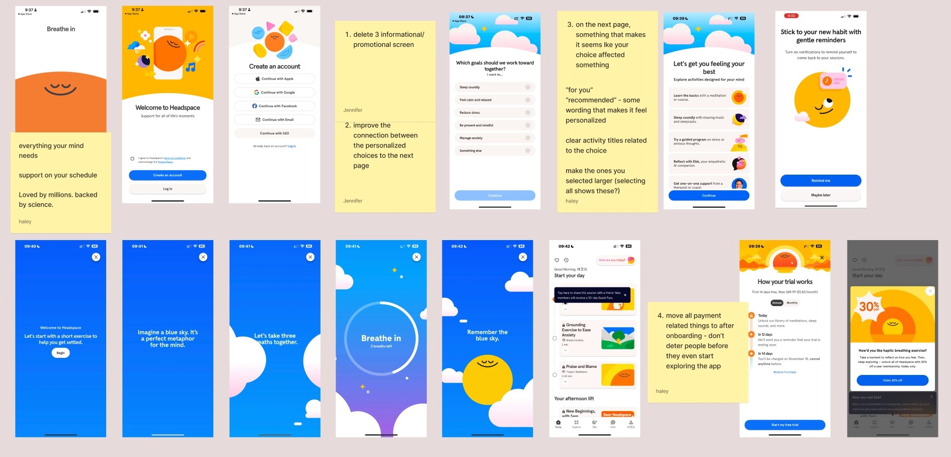
Today's onboarding · 17 screens
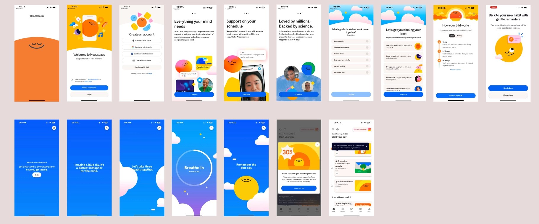
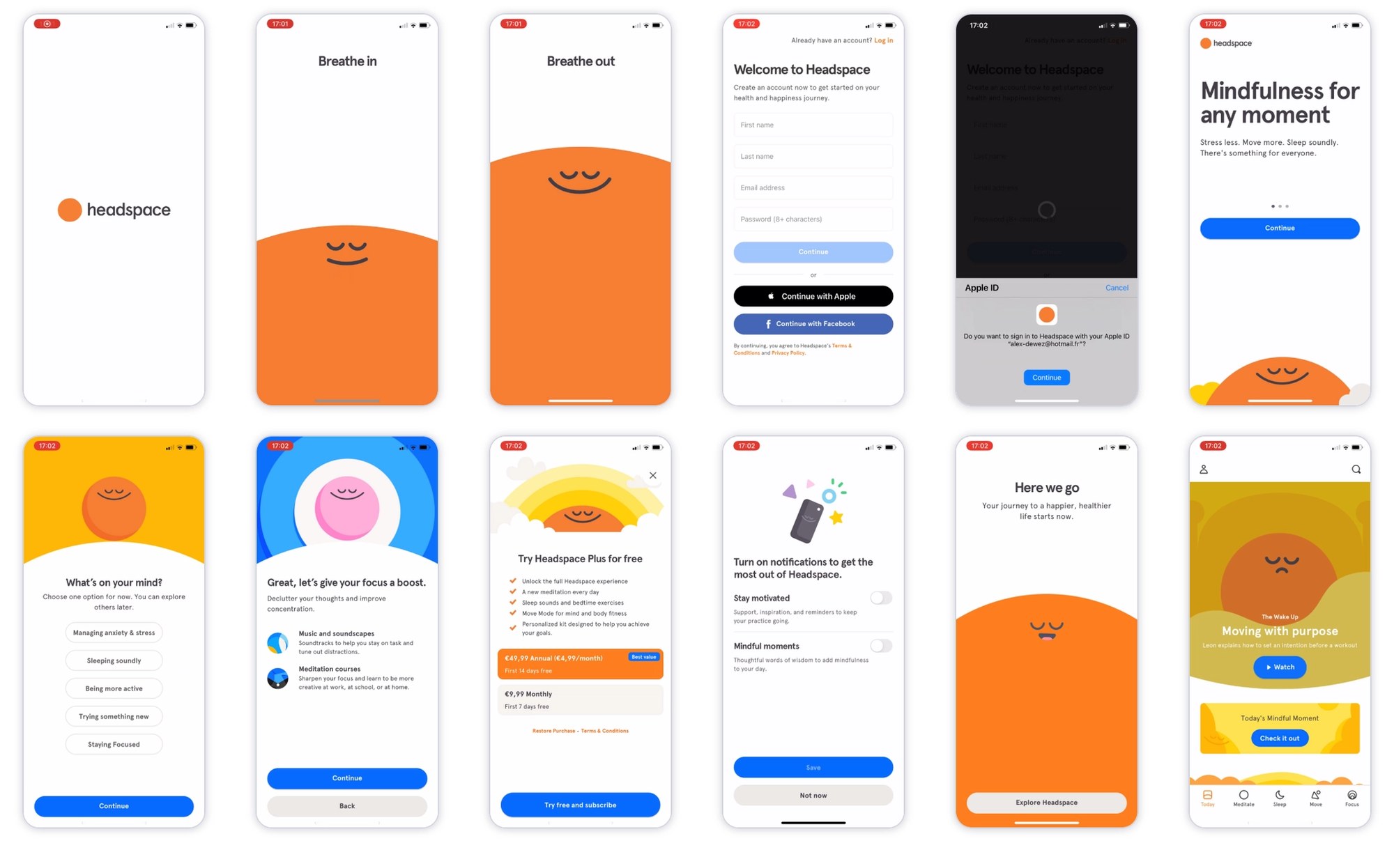
Earlier version · 12 screens, no ads before sign-up
What we flagged, screen by screen
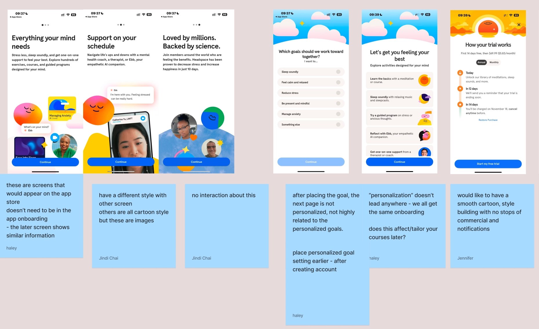
Promo pages use photos; the rest of the app is cartoon.
Three screens with no interaction, repeating later content.
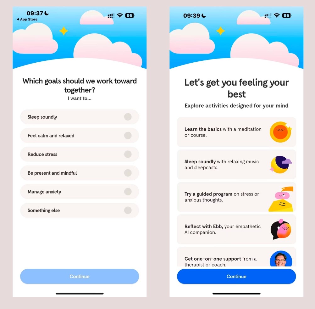
Goal picks don't change the next screen.
Trial pricing and a 30% pop-up land before the first session.
Pain points
What the journey surfaced: four moments where an anxious user stops trusting the app.
Quotes are what our personas would be thinking, written from our walkthroughs.
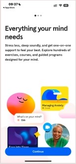
Three App Store style pages, photos instead of the cartoon world, nothing to tap.
"Are you here for me, or for my card?"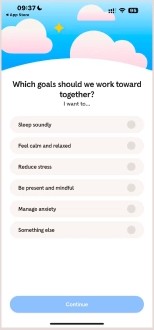
Pick your goals, get the same next screen as everyone else.
"Then why did you ask?"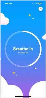
1.5 to 5 minutes of guided breathing, and the blue-sky story keeps getting interrupted.
"I came to sleep, not to train."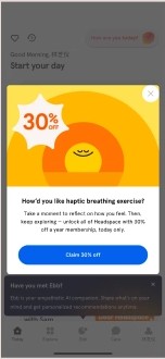
Trial pricing, a 30% offer and notification asks stack up before any calm.
"This feels like a store."Opportunities
One question, three places to act.
let an anxious person reach their first calm moment in half the time, without losing what Headspace needs to say?
the three App Store style promo screens and anything priced before sign-up.
the promo message into the breathe-in / breathe-out animation users already like.
goal selection to a visibly different next screen.
Ideation
Early directions on the flow itself.
No ads before sign-up; delete three promo screens.
A personalization flow that visibly changes recommendations.
Make breathing in and out the one thing people remember.
Keeping the Headspace voice
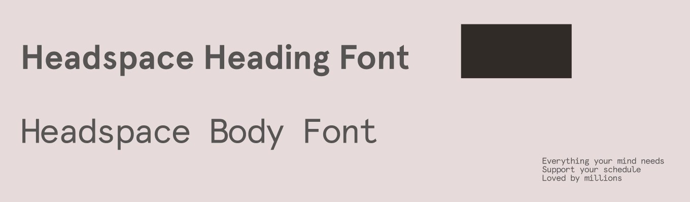
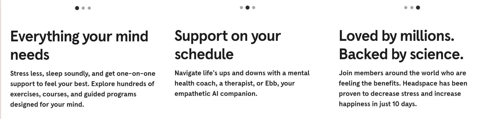
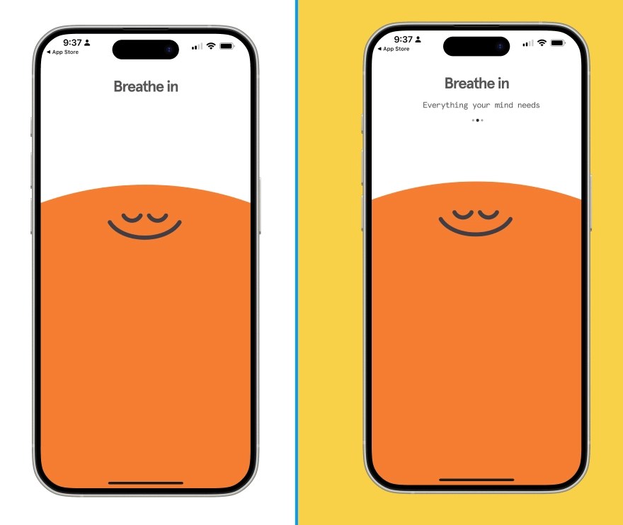
We matched the heading and body type so the new copy sits inside the app without a seam, and tested which promo line was worth keeping: "Stress less, sleep soundly" over "Everything your mind needs."
Final design
Three changes, before and after.
They looked like App Store previews, broke the cartoon style, had nothing to tap, and repeated later screens.
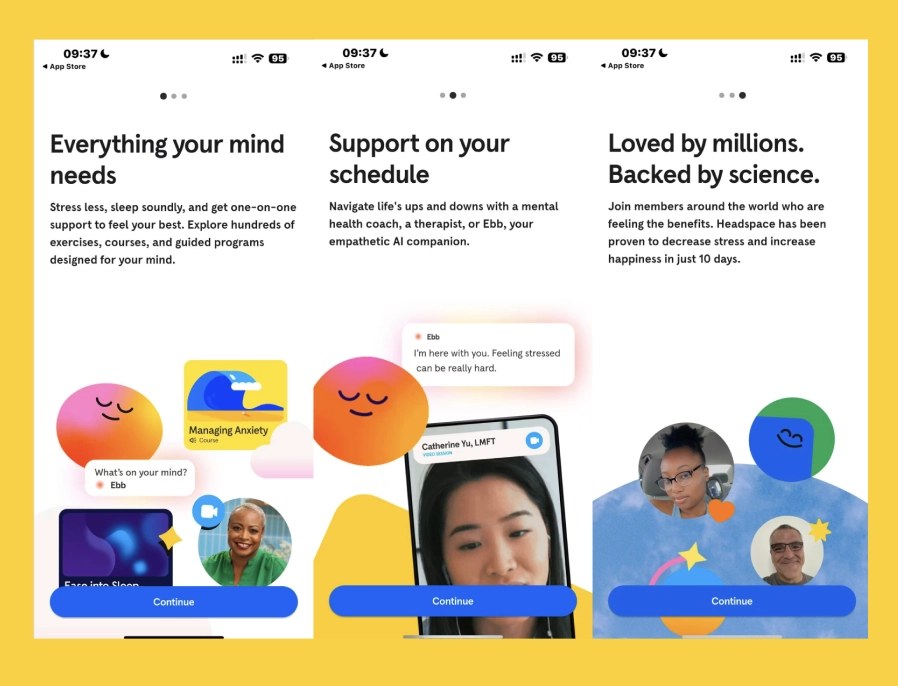
Key lines from the deleted pages move into the opening breathe-in / breathe-out pop-up. The animation runs a little longer; context stays, flow stays smooth. My part.
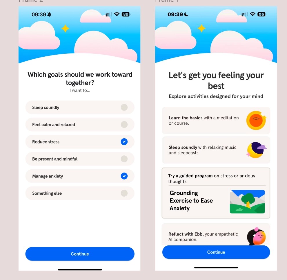
Pick "Reduce stress" and "Manage anxiety", and the next screen highlights a grounding exercise for anxiety, labelled so it reads as recommended, not generic.
Testing
12 people walked the new flow: classmates, ITP students and Design Lab.
- Everyone agreed the three promo pages should go
- "I love the combo of the breathing exercise."
- "Love the idea of adding the animation for the leading page."
- Shorter, less time-consuming
- One tester felt text inside the breath was "being controlled by the company"
- People wanted to see course titles under the goal they picked
- Hierarchy and UX writing on the activity list still too even
The 3-minute target is estimated from screen count, not timed with users. Next round: time the same 12 people end to end, and test the breath-text with and without copy.
Learned
A full UX audit is possible in a week if you walk the flow as a user, not a designer.
Clarity and continuity beat extra marketing screens, especially in a wellness app.
"For you" and a matching title did more than any new feature.
Next